Introducing | Lucia Catellani
last updated 30 August 2019

Talented illustrator and graphic designer Lucia Catellani works on artistic projects from her home in Reggio Emilia, in the middle of the Italian food valley.
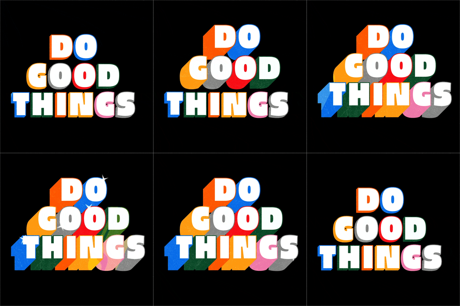
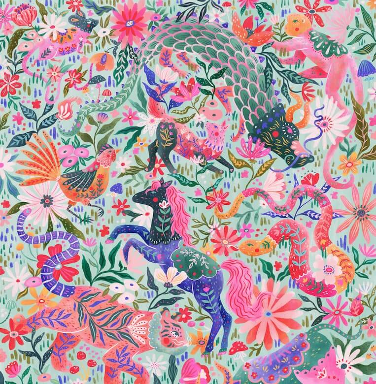
During her studies she started investigating the world of food, and since then she has worked on branding and packaging projects for restaurants, shops, farms and festivals - featuring her trademark bright pops of colour combined with hand lettering and layers of texture.
Here Lucia shares where she finds the inspiration for her work, what her creative process involves, and how her career took shape from a young age.
Could you tell us a little about your background and how you got into illustration?
I have been working as a graphic designer for almost a decade, working on a range of projects such as brand identity, packaging and editorial design.
From the very beginning I was always more interested in creating original artwork than buying photographs or icon sets. It ended up being beneficial for future projects, all of which had a very distinctive style, and for myself, because after working on countless letterings, maps and patterns, I eventually developed my own method and skills.

Over the last few years, I have been trying to focus more and more on illustration and I have been really enjoying the process. When you are a freelancer though, you are in charge of so many tasks and I realized I needed to create more space for creativity. That’s why I joined The Bright Agency and I am so happy to start this collaboration!
Where do you work and what is your practice like?
My studio is in the attic of my apartment, in the historical centre of Reggio Emilia, Italy. It is a very quiet space, full of light; I love to fill it with plants, books and prints. I have a desk equipped for the digital work, which is the most substantial part of my practice, and I can choose to do the sketching at another desk or from the little terrace outside.

Whether I have to create lettering, visualize a recipe or to illustrate a map, it is essential for me to start with a pencil and a sheet of paper. I can deal with shapes and composition better when it comes to sketching, whereas the colouring process and the finalisation is always digital.
What has most inspired your work to date?
I believe everything around us is a piece of design. Not only the material objects we use and experience - like books, chairs or posters - but also the ordinary activities we pursue every day - like cooking, running or travelling.
I look for inspiration in the details of everyday life, in the things we notice when we are present in a space or time. Usually it is right in that moment that ideas come up. Also, research is an important part of my practice. I constantly look for new styles, approaches and techniques in every field of creativity: from typography to packaging design, from magazines to children’s books, from interior design to street art. Building a visual catalogue in your head is a good habit, so when you have to deal with a new project it is easy to find good references.

What’s the last piece of illustration that made you go ‘wow’?
I was impressed by one of the last pieces made by Olimpia Zagnoli for Pride. Her colourful illustration was printed on the giant steps outside the Apple Store in Piazza Liberty, Milan. It was a portrait of two women and a big heart, playing with perspective and negative space. I love it when illustrators use their art to express positive messages.
To see more of Lucia’s work, view her portfolio here.
If you are interested in working with Lucia, please contact Helen Biles.
 How we work
 What we do
 Meet the team
 Enquiry
 Submissions
 Artists
 Agents
 Collections
 Submissions
 Artists
 Agents
 Collections
 Submissions
 Authors
 Artists
 Agents
 Collections
 Submissions
 Animators
 Agents
 Collections
 Submissions
 Artists
 Agents
 Collections
 Submissions
 Authors
 Agents
 Submissions
 Blog
Blog