 How we work
 What we do
 Meet the team
 Artists
 Agents
 Collections
 Submissions
 Artists
 Agents
 Collections
 Submissions
 Authors
 Artists
 Agents
 Collections
 Submissions
 Animators
 Agents
 Collections
 Submissions
 About
About
 Authors
 About
About
 Submissions
 Blog
Blog
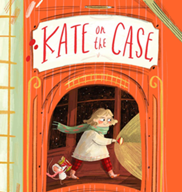
In the Studio with Hannah Peck
last updated 06 July 2021
Hannah Peck is an author and illustrator based in London. Her love of books led her to study English at university, where she stocked up on Gothic stories, English lore, and mythical poems that would later inspire her narrative illustrations.
In this edition of In The Studio, Hannah gives us an insight into the crafting and artistic processes she went through to create her debut author-illustrated book Kate on the Case, released July 2021 by Picadilly Press.
Illustration Style
As someone who works in picture books, middle-grade books covers, early fiction and sometimes even educational, I could talk for months about style and how it changes, both as you grow and work across different markets and genres.
 Storyboarding for Kate on the Case
For Kate on the Case, my first author-illustrated book, the visual style was very much informed by how I wanted to make first time solo readers feel. It sits in the age-range that I remember vividly – pouring over the details and hidden jokes in the illustrations and immersing myself in a world of fiction for the first time without a parent present.
 Designing the elements that make the world breathe
I knew details, humour, and a rich, inviting world were going to be important. Things like maps, a character introduction page, and pages from books the characters themselves are reading are great ways to pull the reader further into the world.
Writing Process
 Working on the cover design
When it comes to stories I tend to start visually, and with a sense of place. I create enormous Pinterest boards and fill up sketch books. I might even test out a cover to see what space the story would sit in. The plot is often informed by this and developed alongside it. The setting of Kate on the Case (a sleeper train) already has effects on the plot; it’s a contained space. You’re limited in where you can go from there, which I find helpful as I tend to be easily swayed by any new idea that swoops into my head (let it never be said I am not enthusiastic).
 A Pinterest board filled with inspiration
A train means potential stowaways, themed carriages – dormitories, kitchen, luggage car – and a host of guests from all over the world, each with a motive for being aboard (Thank you, Agatha Christie!). I found once I had established the setting, I had all the ingredients I need to move forward with plot.
Characters
 Crafting real character
I usually try out different expressions and go through a few outfit changes before I settle on something that I feel captures who each character truly is. I often find myself writing dialogue alongside them; how they would speak informs what they might look like, or what sort of accessories they are sporting.
 All the elements of a great villain
Everything within a character has to read as cohesive, so it’s easy to digest for the reader. I used repeated shapes to achieve this – curves and fluid lines for Kate, sharp lines and points for Madame Maude, our ‘villain’.
Art Process / Two-Tone
 An example of two-tone
While I work mainly with digital tools, part of what I loved about illustrated books as a child was the natural feel to them – the pencil marks and scribbles – and wanted to lean into this hand-crafted aesthetic with Kate on the Case.
I found using the two-tone process helped me achieve this by providing a limitation. One of the things I find hard about working digitally is a lack of limitation means you can be easily overwhelmed with possibility, and work might end up looking a little stilted or too slick.
 Making the action pop
With two-tone, the artwork is both created and printed in two separate layers, one in black and white, one with the chosen colour, which is printed on-top of the first. In this case I was lucky enough to get a gorgeous Pantone.
Thinking consciously about which elements would be coloured, how the inks would sit on top of one-another, and how to create texture and drama within this set-up slowed me down, and helped me be more thoughtful as to my techniques.
 Artwork with and without the colour layer
Humour
 Sketch and final image comparison
Humour is a big part of writing for children, especially in the 5-7 age bracket. It’s one thing to write funny one-liners and have characters over-react, under-react, or flirt with the surreal, but the tone has to be matched with the illustrations. I find I use a more lose, fluid style when highlighting moments of humour, especially when it’s more physical or slap-stick.
 A spread from Kate on the Case
Facial expressions are key – I like to play around with eyes and often have one pupil bigger than the other for moments which read as shock or surprise for the character, when the reader is, of course, in on the joke.
This poor cat was the butt of many jokes!
Kate on the Case (Picadilly Press), is out in the UK on 8th July 2021. Find out more, and buy here.


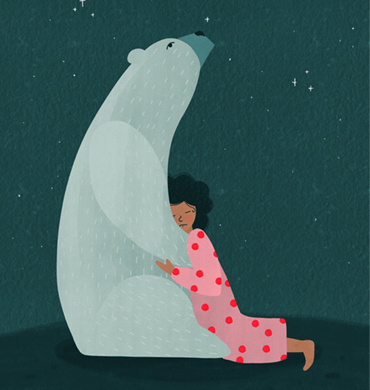
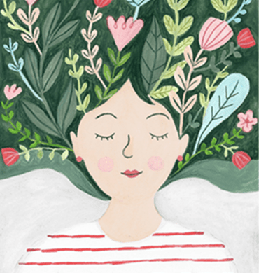
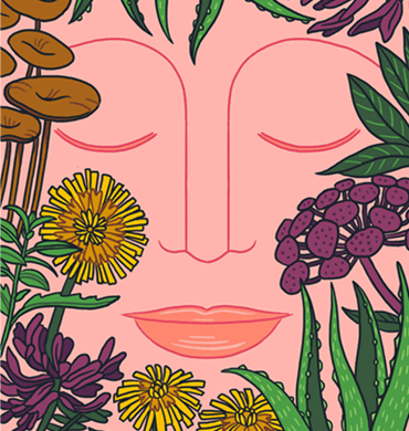
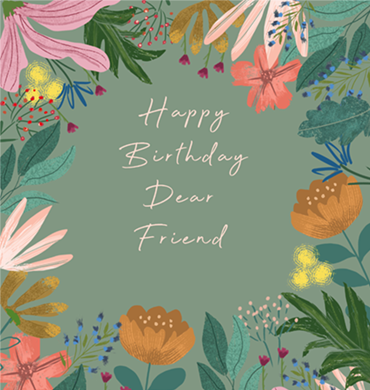
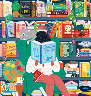
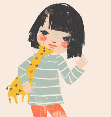
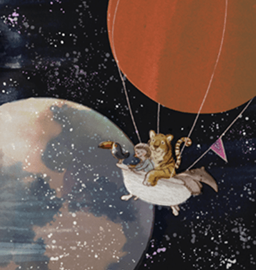
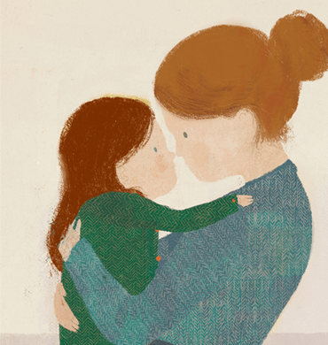
 A selection of other work by Hannah Peck
Hannah Peck is represented by Arabella Stein — to work with Hannah please contact Arabella. You can find out more about Hannah here.